Introduction
Hey there, thanks for purchasing Beetle HTML template!
Beetle is a flat-style HTML template best suitable for portfolios, app showcasing and blogging.
We used a modular architecture made of section to give you maximum flexibility and comfort during the configuration process. In this documentation you’ll learn all you need to know about the powerful features of Beetle HTML template.
Also, we have designed this template with the intent to release a WordPress theme that we are currently developing. To this purpose you may notice that every single HTML page includes a special class on the <body>.
What's included
In the package you have downloaded you will find:
- The template as you see it in the demo (obviously, except the images!)
- The documentation (we guess you’ve already found it!)
- A mockup builder including some Photoshop PSD files to quickly build custom device mockup images to be included into the intro.
Browser compatibility
Beetle HTML v1.0 is fully compatible with Chrome, Safari, Firefox, IE10+ and iOS latest versions. Currently you may experience some issues with IE9. IE8 and lower versions are not supported.
Header Menu
In this section we are going to analyze how the header menu works and its configuration options. We have three different configurations for the header menu in case we see an intro as below:
-
Transparent with white types:

<header role="banner" class="transparent light">
-
Transparent with dark types:
<header role="banner" class="transparent">
-
White background:
<header role="banner">
Logo options
We have three different options for logo as well:
-
Text logo:
<div id="brand">
	<h1 class="reset">
		<a href="home-01.html">Beetle</a>
	</h1>
</div><!-- brand -->
-
Image logo:
<div id="brand">
	<h1 class="reset">
		<a href="home-01.html">
			<img id="default-logo" src="img/logo.png" alt="Brand Name">
			<img id="retina-logo" src="img/logo-retina.png" alt="Brand Name">
		</a>
	</h1>
</div><!-- brand -->
Retina display option
It is possible to assign a given image for retina displays. The way you choose to display a regular image instead of a retina one is automatic through CSS. -
Image and text logo:
<div id="brand">
	<h1 class="reset">
		<a href="home-01.html">
			<img id="default-logo" src="img/logo.png" alt="Brand Name">
			<img id="retina-logo" src="img/logo-retina.png" alt="Brand Name">
			Beetle
		</a>
	</h1>
</div><!-- brand -->
Intro
With Intro we mean the slider right below the header. I like to call it INTRO instead of SLIDER because it is really an area that is not necessarily a slider, since it can hold a single image as well. Intro takes advantage of OWL Carousel jQuery pulgin by Bartosz Wojciechowski.
Intro options
To make things easy, let’s start to identify the wrapping <div> that contains slides.
<div id="intro-wrap" class="full-height" data-height="33.333">
	<div id="intro" class="preload darken more-button" data-autoplay="5000" data-transition="fade" data-navigation="true" data-pagination="false">

		[Qui dentro ci metteremo le singole slide]

	</div><!-- intro -->
</div><!-- intro-wrap -->-
Height:
Default height of an Intro is 33.333em (namely 600px in the desktop version). Nevertheless, it is possible to set up a custom value using the attribute
data-height="22.222". The value needs to be set in em. If you don’t handle this unit of measurement, you can use an on line converter taking into account that the basic value is 18px.
To get a full screen intro, you only need to add the class
.full-widthto the#intro-wrap. Full width mode will overwrite default height and the default value set in the attributedata-height. -
Autoplay:
To let the slider automatically rotate every given seconds, you need to use the attribute
data-autoplay, assigning a value in ms (milliseconds). In fact, if you would like the slider to rotate every 3 seconds, the attribute to print isdata-autoplay="3000".Note
trueefalseare the other allowed values, where the first one sets the auto play at a default value (5000), and the second one disables the auto-rotation. Keep in mind that auto play can be also disabled omitting thedata-autoplayor omitting the value as follows:data-autoplay="". -
Transition styles:
We have 9 different CSS3 transition styles for the slider, that can be determined through the attribute
data-transition:data-transition="fade": crossed fadedata-transition="backSlide": determines zoom-out and zoom-indata-transition="goDown": drops from the topdata-transition="fadeUp": zoom-in and zoom-out + fadedata-transition="scaleDown": zoom-out / pause / zoom-out (this kind of transition can have conflicts on Firefox)data-transition="scaleDownRight": saver window from rightdata-transition="scaleUpLeft": exit on the left and zoom-indata-transition="fadeTop": roll effectdata-transition="overlap": overlap effect
Note
Ifdata-transitionis omitted or the value is missing (data-autoplay="") the default transition of the plugin will be used. If the value is not included in any of the 8 listed transitions, the slider is not going to work properly. -
Navigation arrows:
To decide if you are going to use the navigation arrows or not, you need to specify if
data-navigation="true"odata-navigation="false".Note
If you completely omitdata-navigationor the value (ex.:data-navigation="") the navigation arrows are not going to be displayed. -
Pagination bullets:
If you want to choose to display the pagination bullets or not, you need to specify if
data-pagination="true"ordata-pagination="false".Note
If you completely omitdata-paginationor the value (ex.:data-pagination="") the pagination bullets are not going to be displayed. -
Scroll arrow:
If you want to add the icon with a downward arrow to scroll and go right to the main content, you need to add the class
.more-buttonto the#intro.Note
This option is not compatible with the pagination bullets. So, ifdata-pagination="true", the icon will not be shown even if the class.more-buttonto the#introis present. -
Darken layer:
If you want to darken the slides images with a layer of black that has 30% opacity, giving more prominence to menu elements and captions, you need to add the class
.darkento the#intro.
Intro slides
Inside the wrapping <div> that defines the intro, we can include every single slide. Remember that we can also use one single slide; in this case the plugin of the slider is not going to be used and some of the options seen above (such as: Autoplay, Transition styles, and so on) will not count.
The intro can have three different kinds of slides: Image background, Device mockup and Map. Let’s see some examples of these configurations translated into codes.
-
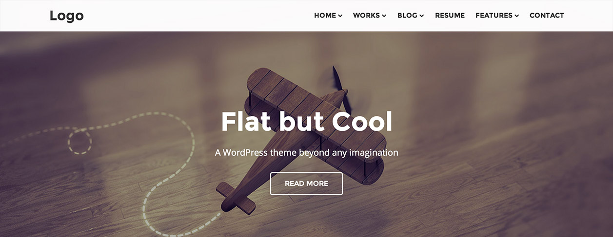
Image background

<div class="intro-item" style="background-image: url(img/bg12.jpg);">
	<div class="caption">
		<h2>Feliz ao Contrario</h2>
		<p>An Awesome Character</p>
		<a class="button white transparent" href="#">Read More</a>
	</div><!-- caption -->
	<div class="photocaption">
		<h4>Design by Isabela Rodrigues</h4>
	</div><!-- photocaption -->
</div>
-
Device mockup
We have three different layouts for the Device mockup.
Device on the left:
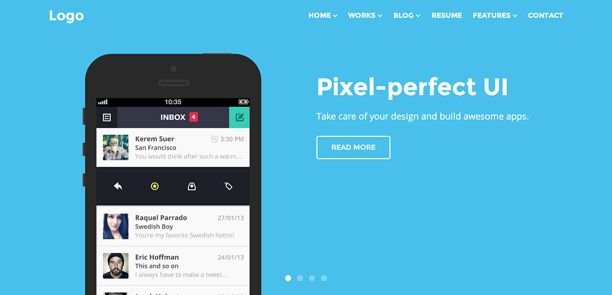
<div class="intro-item" style="background-color: #4FC1E9;">
	<div class="intro-mockup-wrapper">
		<div class="caption-mockup caption-right column six last-special">
			<h2>Pixel-perfect UI</h2>
			<p>Take care of your design and build awesome apps.</p>
			<a class="button white transparent" href="#">Read More</a>
		</div><!-- caption -->
		<div class="intro-mockup intro-left column six">
			<img src="img/bg20.png" alt="">
		</div><!-- intro-mockup -->
	</div><!-- intro-mockup-wrapper -->
</div><!-- intro-item -->
Device on the right:
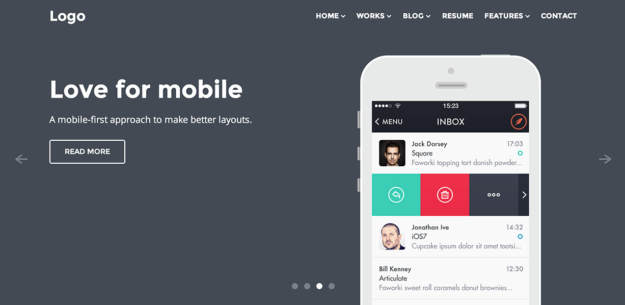
<div class="intro-item" style="background-color: #434A54;">
	<div class="intro-mockup-wrapper">
		<div class="caption-mockup caption-left column six">
			<h2>Love for mobile</h2>
			<p>A mobile-first approach to make better layouts.</p>
			<a class="button white transparent" href="#">Read More</a>
		</div><!-- caption -->
		<div class="intro-mockup intro-right column six last">
			<img src="img/bg19.png" alt="">
		</div><!-- intro-mockup -->
	</div><!-- intro-mockup-wrapper -->
</div><!-- intro-item -->
Centered device:
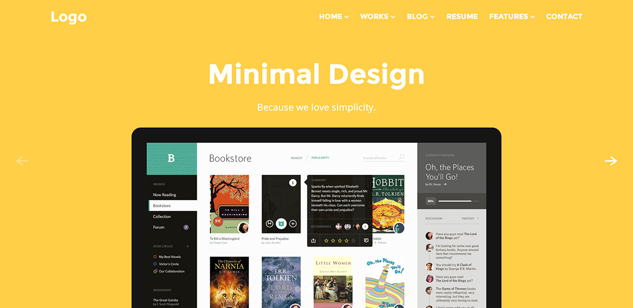
<div class="intro-item" style="background-color: #FFCE54;">
	<div class="intro-mockup-wrapper">
		<div class="caption-mockup">
			<h2>Minimal Design</h2>
			<p>Because we love simplicity.</p>
		</div><!-- caption -->
		<div class="intro-mockup">
			<img src="img/bg18.png" alt="">
		</div><!-- intro-mockup -->
	</div><!-- intro-mockup-wrapper -->
</div>
How to create mockups to be contained into the intro
The device mockup configuration just shown, contrary to mockup carousels, consists in a single image containing both the mockup and the content of the mockup.
In the downloaded package, we included a mockup builder, a package of PSD files to easily create the mockup to be put in the intro. To insert a custom image in the chosen mockup, you need to open the related PSD file with Photoshop. In the windows with layers, we will have a layer called Screenshot. Double click on that layer; a new window will open and you will be able to paste the screenshot to be inserted in the mockup. Save and close the window. At this point the original file will be updated with the pasted image. Export the image in PNG format with transparency and include it in the intro.
-
Map
We can also use a map inside the intro. For options regarding maps, see the Map section.
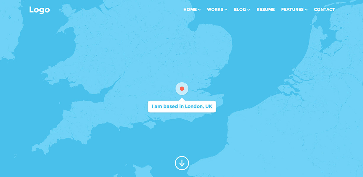
<div class="map" data-maplat="51.511214" data-maplon="-0.119824" data-mapzoom="7" data-color="aqua" data-height="22.222" data-img="img/marker.png" data-info="I am based in London, UK"></div>
Parallax
Parallax takes advantage of Skrollr JS plugin by Prinzhorn. In some cases it can create some conflicts on some devices. For this reason, we have the possibility to partially or completely disable it.
-
Disable parallax:
To completely disable parallax you will need to add the class
.no-parallaxto the<body>. -
Disable parallax on touch screen devices:
Mobile browsers try to save battery wherever they can. That's why mobile browsers delay the execution of JavaScript while you are scrolling.
By default, parallax is disabled on all touch devices because it may cause some relevant issues.
Sections
For this template we decided to use a modular architecture made of sections to allow you to build a website one step at the time.
Every element section has a base structure like this:
<section class="row section">
	<div class="row-content buffer even clear-after">

		[Here the content]

	</div>
</section>
To add a background color, white text and a title:
<section class="row section text-light" style="background-color:#FF605F;">
	<div class="row-content buffer even clear-after">
	<div class="section-title"><h3>An Awesome Title</h3></div>

		[Here the content]

	</div>
</section>
Don't forget
The only elements that do not need a section are the CTA (call to action) and the Map sections.Columns
Beetle HTML template takes advantage of Layers CSS framework by Jerry Jäppinen. To know more about built-in classes, read the documentation.
Note
To center the text, you can use the class.centertxt.
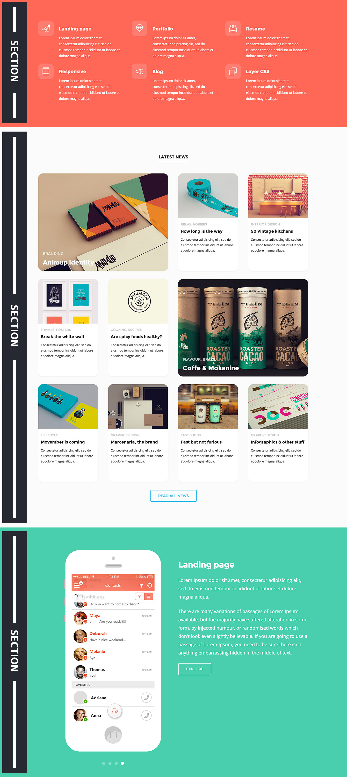
Featured columns
With featured columns we refer to columns including icons, as in the following examples.
Example with small icons:
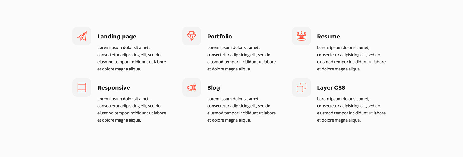
<div class="column four">
	<div class="small-icon red"><i class="icon icon-paperfly"></i></div>
	<div class="small-icon-text clear-after">
		<h4>Landing page</h4>
		<p class="text-xs">Lorem ipsum dolor sit amet, consectetur adipisicing elit, sed do eiusmod tempor incididunt ut labore et dolore magna aliqua.</p>
	</div>
</div>
<div class="column four">
	<div class="small-icon red"><i class="icon icon-diamond"></i></div>
	<div class="small-icon-text clear-after">
		<h4>Portfolio</h4>
		<p class="text-xs">Lorem ipsum dolor sit amet, consectetur adipisicing elit, sed do eiusmod tempor incididunt ut labore et dolore magna aliqua.</p>
	</div>
</div>
<div class="column four last">
	<div class="small-icon red"><i class="icon icon-crown"></i></div>
	<div class="small-icon-text clear-after">
		<h4>Resume</h4>
		<p class="text-xs">Lorem ipsum dolor sit amet, consectetur adipisicing elit, sed do eiusmod tempor incididunt ut labore et dolore magna aliqua.</p>
	</div>
</div>
<div class="column four">
	<div class="small-icon red"><i class="icon icon-tablet"></i></div>
	<div class="small-icon-text clear-after">
		<h4>Responsive</h4>
		<p class="text-xs">Lorem ipsum dolor sit amet, consectetur adipisicing elit, sed do eiusmod tempor incididunt ut labore et dolore magna aliqua.</p>
	</div>
</div>
<div class="column four">
	<div class="small-icon red"><i class="icon icon-megaphone"></i></div>
	<div class="small-icon-text clear-after">
		<h4>Blog</h4>
		<p class="text-xs">Lorem ipsum dolor sit amet, consectetur adipisicing elit, sed do eiusmod tempor incididunt ut labore et dolore magna aliqua.</p>
	</div>
</div>
<div class="column four last">
	<div class="small-icon red"><i class="icon icon-multiview"></i></div>
	<div class="small-icon-text clear-after">
		<h4>Layer CSS</h4>
		<p class="text-xs">Lorem ipsum dolor sit amet, consectetur adipisicing elit, sed do eiusmod tempor incididunt ut labore et dolore magna aliqua.</p>
	</div>
</div>
Example with big icons:
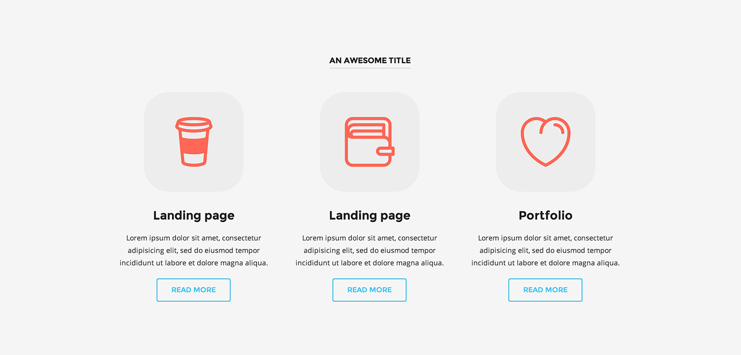
<div class="column four centertxt">
	<div class="big-icon red"><i class="icon icon-tumbler"></i></div>
	<div class="big-icon-text clear-after">
		<h4>Landing page</h4>
		<p class="text-s">Lorem ipsum dolor sit amet, consectetur adipisicing elit, sed do eiusmod tempor incididunt ut labore et dolore magna aliqua.</p>
		<a class="button transparent aqua" href="#">Read more</a>
	</div>
</div>
<div class="column four centertxt">
	<div class="big-icon red"><i class="icon icon-pocket"></i></div>
	<div class="big-icon-text clear-after">
		<h4>Landing page</h4>
		<p class="text-s">Lorem ipsum dolor sit amet, consectetur adipisicing elit, sed do eiusmod tempor incididunt ut labore et dolore magna aliqua.</p>
		<a class="button transparent aqua" href="#">Read more</a>
	</div>
</div>
<div class="column four last centertxt">
	<div class="big-icon red"><i class="icon icon-heart"></i></div>
	<div class="big-icon-text clear-after">
		<h4>Portfolio</h4>
		<p class="text-s">Lorem ipsum dolor sit amet, consectetur adipisicing elit, sed do eiusmod tempor incididunt ut labore et dolore magna aliqua.</p>
		<a class="button transparent aqua" href="#">Read more</a>
	</div>
</div>
Don't forget
Don’t forget to include the sections to get results as shown in the example.CTA
With CTA (call to action) we mean the sections that usually include a short slogan and a button.

<section class="row section call-to-action">
	<div class="row-content buffer even">
		<p>Have you fallen in love with Beetle?</p>
		<a class="button white transparent" href="#">Buy it now!</a>
	</div>
</section>
Mockup carousels
Mockup carousel is an element usually made with a series of images framed inside a mockup. We have two different ways to configure a mockup carousel, "full-width" and "aside". Those elements use OWL Carousel plugin as well.
Full-width mockup carousel
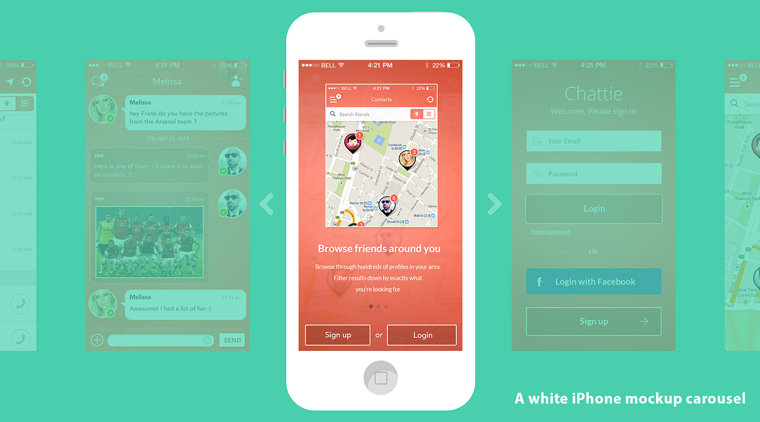
<div class="slider iphone-slider white white-controls" data-autoplay="3000">
	<figure>
		<div><img src="path/img-01.jpg" alt=""></div>
		<div><img src="path/img-02.jpg" alt=""></div>
		<div><img src="path/img-03.jpg" alt=""></div>
		<div><img src="path/img-04.jpg" alt=""></div>
		<div><img src="path/img-05.jpg" alt=""></div>
		<div><img src="path/img-06.jpg" alt=""></div>
		<div><img src="path/img-07.jpg" alt=""></div>
		<div><img src="path/img-08.jpg" alt=""></div>
		<div><img src="path/img-09.jpg" alt=""></div>
		<div><img src="path/img-10.jpg" alt=""></div>
	</figure>
</div>
Don't forget
Of course, to get the mint background, you will have to include the section.For this carousel, we have 7 different types of device mockups. The mockup choice can be made using one of the following classes:
.iphone-slider .white(White iPhone).iphone-slider .grey(Grey iPhone).iphone-slider .black(Black iPhone).ipad-slider .white(White iPad).ipad-slider .grey(Grey iPad).ipad-slider .black(Black iPad).desktop(Apple Monitor)
Default navigation arrows color is grey. Nevertheless, it is possible to use white adding the class .white-controls or black adding the class .dark-controls.
Finally, as already seen with the intro slider, it is possible to change the rotation time of the slides, inserting a value in milliseconds within the attribute data-autoplay.
Note
Other allowed values aretrue and false, , where the first one sets up the autoplay to a default value (5000ms), while the second one disables the auto-rotation. Keep in mind that auto play can be disabled omitting data-autoplay or the value, as is this case: data-autoplay="".
Why device mockups don't show up?
In case device mockups don't show up, maybe you have not uploaded the .htaccess file on your website root.
Mockup frames are provided in SVG format. The benefit of using SVG (acronym of Scalable Vector Graphics) is to have small size and scalable images that looks great on retina displays. Some browsers may fail to display SVG images, so we need two lines of code inside the .htaccess file located into the root:
# To display SVG images
AddType image/svg+xml svg
AddType image/svg+xml svgz
AddEncoding x-gzip .svgz
We have already provided the .htaccess file inside the template folder, you just have to upload it via FTP with a client like Filezilla.
Aside mockup carousel
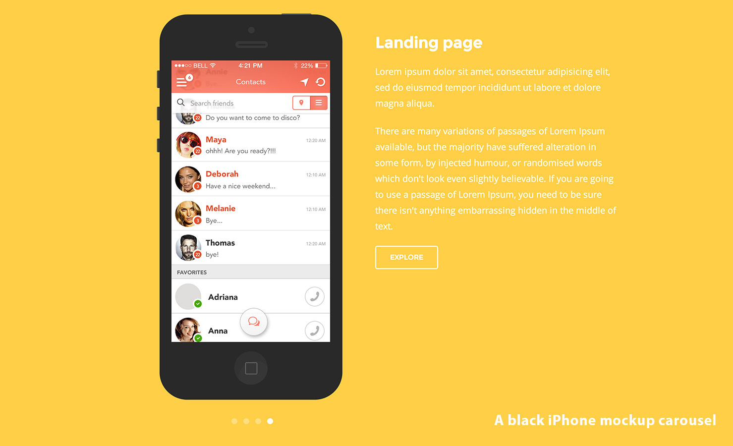
For this carousel as well we have 7 different types of device mockups to choose. The choice of the device mockup is made using the same class already seen in the full-width carousel.
Don't forget
Because the navigation arrows are missing, it is useful to specify classes to change the color of navigation arrows.The autoplay option works in the same way of full-width carousel.
This kind of carousel allows us to choose if we want to align the device mockup to the right or to the left. Let’s take a look at two configuration samples.
Device to the left::
<div class="column six push-six last-special">
	<h2>Landing page</h2>
	<p>Lorem ipsum dolor sit amet, consectetur adipisicing elit, sed do eiusmod tempor incididunt ut labore et dolore magna aliqua.</p>
	<p>There are many variations of passages of Lorem Ipsum available, but the majority have suffered alteration in some form, by injected humour, or randomised words which don't look even slightly believable. If you are going to use a passage of Lorem Ipsum, you need to be sure there isn't anything embarrassing hidden in the middle of text.</p>
	<a class="button transparent white" href="#">Explore</a>
</div>
<div class="side-mockup left-mockup animation">
	<div class="slider iphone-slider black" data-autoplay="3000">
		<figure>
			<div><img src="path/img-01.jpg" alt=""></div>
			<div><img src="path/img-02.jpg" alt=""></div>
			<div><img src="path/img-03.jpg" alt=""></div>
			<div><img src="path/img-04.jpg" alt=""></div>
		</figure>
	</div>
</div>
Device to the right::
<div class="column six">
	<h2>Landing page</h2>
	<p>Lorem ipsum dolor sit amet, consectetur adipisicing elit, sed do eiusmod tempor incididunt ut labore et dolore magna aliqua.</p>
	<p>There are many variations of passages of Lorem Ipsum available, but the majority have suffered alteration in some form, by injected humour, or randomised words which don't look even slightly believable. If you are going to use a passage of Lorem Ipsum, you need to be sure there isn't anything embarrassing hidden in the middle of text.</p>
	<a class="button transparent white" href="#">Explore</a>
</div>
<div class="side-mockup right-mockup animation">
	<div class="slider iphone-slider black" data-autoplay="3000">
		<figure>
			<div><img src="path/img-01.jpg" alt=""></div>
			<div><img src="path/img-02.jpg" alt=""></div>
			<div><img src="path/img-03.jpg" alt=""></div>
			<div><img src="path/img-04.jpg" alt=""></div>
		</figure>
	</div>
</div>
Note
To cancel mockup pop-up animations you just need to remove the class.animation from the .side-mockup.
Images ideal sizes
Here are the ideal sizes for images included in single mockups.
- iPhone image: 320x568px (min) - 540x1136px (max)
- iPad image: 504x378px (min) - 1008x756px (max)
- Desktop image: 574x315px (min) - 1148x630px (max)
Skills rings
Skills rings can be customized in many ways, from color to animation time. Those elements take advantages of Easy Pie Chart jQuery plugin by rendro.

<div class="chart" data-percent="73" data-bar-color="#fd685b" data-animate="2000">
	<div class="chart-content">
		<div class="percent"></div>
		<div class="chart-title">User Interface</div>
	</div><!-- chart-content -->
</div><!-- chart -->
The example shown above is easy to understand. Here are the three main options:
- Percent value: it can be defined with a numeric value in the attribute
data-percent - Ring color: it can be defined inserting an hexadecimal color value in the attribute
data-bar-color - Animation time: it can be defined inserting a ms value in the attribute
data-animate
Note
You just need to insert the percent value in the attributedata-percent. The <div class="percent"></div> must be empty.
Don't forget
Skills rings don't need to be nested into.column divs.
Timeline
Timeline is a very useful feature to be included in a resumé page.
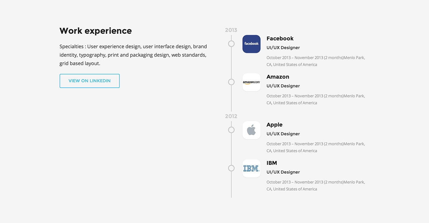
<div class="timeline-label column six">
	<h4>Work experience</h4>
	<p>Specialties : User experience design, user interface design, brand identity, typography, print and packaging design, web standards, grid based layout.</p>
	<a class="button transparent aqua">View on Linkedin</a>
</div><!-- timeline-label -->
<div class="timeline column six last">
	<div class="year">
		<time datetime="2013">2013</time>
		<div class="experience">
			<span class="circle"></span>
			<div class="experience-img"><img src="img/asset01.jpg" alt=""></div>
			<div class="experience-info clear-after">
				<h5>Facebook</h5>
				<div class="role">UI/UX Designer</div>
				<p>October 2013 – November 2013 (2 months)Menlo Park, CA, United States of America</p>
			</div><!-- experience-info -->
		</div><!-- experience -->
		<div class="experience">
			<span class="circle"></span>
			<div class="experience-img"><img src="img/asset02.jpg" alt=""></div>
			<div class="experience-info clear-after">
				<h5>Amazon</h5>
				<div class="role">UI/UX Designer</div>
				<p>October 2013 – November 2013 (2 months)Menlo Park, CA, United States of America</p>
			</div><!-- experience-info -->
		</div><!-- experience -->
	</div><!-- year -->
	<div class="year">
		<time datetime="2012">2012</time>
		<div class="experience">
			<span class="circle"></span>
			<div class="experience-img"><img src="img/asset03.jpg" alt=""></div>
			<div class="experience-info clear-after">
				<h5>Apple</h5>
				<div class="role">UI/UX Designer</div>
				<p>October 2013 – November 2013 (2 months)Menlo Park, CA, United States of America</p>
			</div><!-- experience-info -->
		</div><!-- experience -->
		<div class="experience">
			<span class="circle"></span>
			<div class="experience-img"><img src="img/asset04.jpg" alt=""></div>
			<div class="experience-info clear-after">
				<h5>IBM</h5>
				<div class="role">UI/UX Designer</div>
				<p>October 2013 – November 2013 (2 months)Menlo Park, CA, United States of America</p>
			</div><!-- experience-info -->
		</div><!-- experience -->
	</div><!-- year -->
</div><!-- timeline -->
Team
The team section can be useful to introduce your work team. If used combined with colonne it will be possible to show whatever number of teammates you wish.
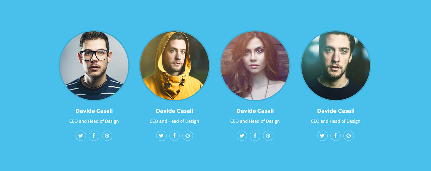
<div class="column three">
	<figure class="about-us">
		<img src="img/about-01.jpg" alt="">
		<figcaption>
			<h4>Davide Casali</h4>
			<p>CEO and Head of Design</p>
			<div class="meta-social">
				<ul class="inline">
					<li><a href="#" class="twitter-share border-box"><i class="fa fa-twitter fa-lg"></i></a></li>
					<li><a href="#" class="facebook-share border-box"><i class="fa fa-facebook fa-lg"></i></a></li>
					<li><a href="#" class="pinterest-share border-box"><i class="fa fa-pinterest fa-lg"></i></a></li>
				</ul>
			</div>
		</figcaption>
	</figure>
</div>
Note
In CSS, we provided colors for all other social network icons. You will only need to use the following classes:.dribbble-share, .flickr-share, .github-share, .gplus-share, .instagram-share, .linkedin-share, .skype-share, .vimeo-share, .youtube-share.
Slogan
Slogan is a section built with a heading title, one paragraph an "on-screen" animation.

<div class="slogan animation">
	<h2>This is an awesome heading slogan!</h2>
	<p>Here you can type a subtitle.</p>
</div><!-- slogan -->
Note
You need to use a section for slogans too. To cancel pop-up animations in mockup you just need to remove the class.animation from the .slogan.
Milestone
A milestone is an element that takes advantage of jquery-countTo jQuery plugin. jQuery plugin. It can be used in combination with columns.
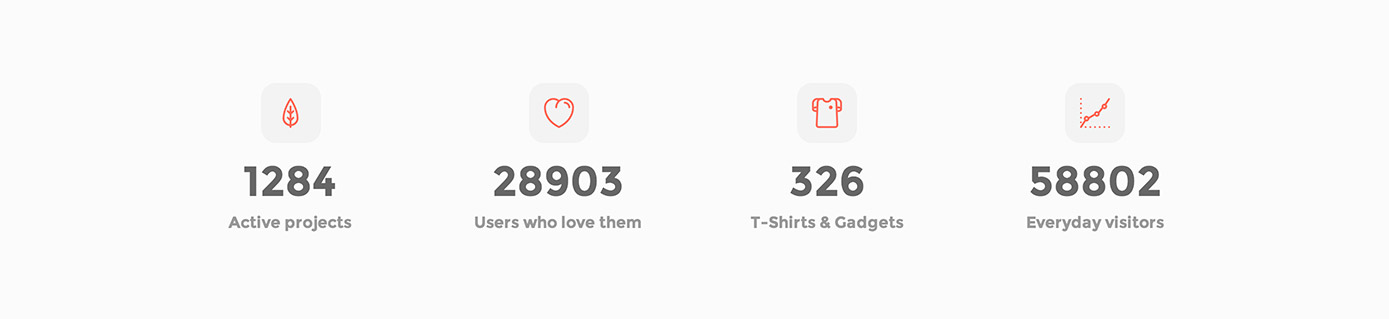
<div class="count-item">
	<div class="small-icon red"><i class="icon icon-leaf"></i></div>
	<div class="count-number" data-from="0" data-to="1284" data-speed="1000" data-refresh-interval="25"></div>
	<div class="count-subject">Active projects</div>
</div><!-- count-item -->
In the .count-number it is possible to name the numeric part of the milestone using special attributes.
data-from: the number to start counting fromdata-to: the number to stop counting atdata-speed: the number of milliseconds it should take to finish countingdata-refresh-interval: the number of milliseconds you have to wait for the counter to refresh
Note
You just need to specify the numeric value of the attributedata-to. The <div class="count-number" ... ></div> must be kept empty.
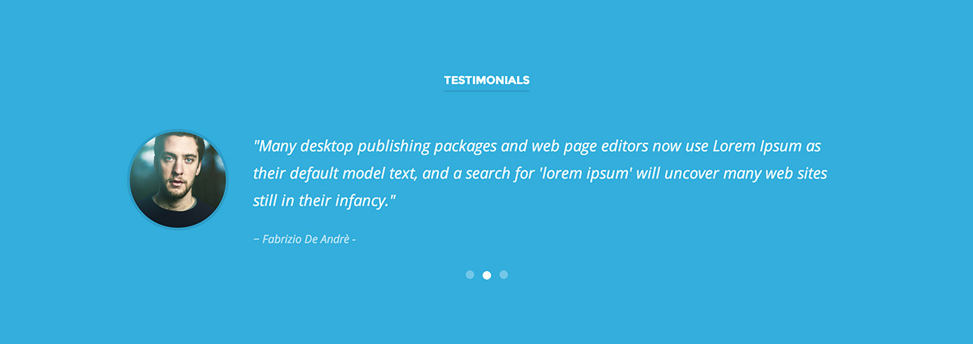
Testimonial carousel
Testimonial carousel takes advantage of OWL Carousel jQuery pulgin. It can be configured in two different ways.
Only text carousel
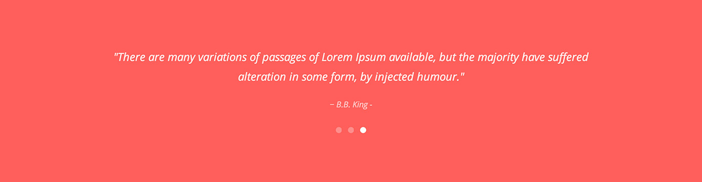
<div class="testimonial-slider centertxt" data-autoplay="5000" data-pagination="true" data-transition="fade" data-autoheight="false">
<div class="quote">
<div class="column twelve last">
<p>"It is a long established fact that a reader will be distracted by the readable content of a page when looking at its layout."</p>
<div class="author">John Lennon</div>
</div><!-- column -->
</div><!-- quote -->
<div class="quote">
<div class="column twelve last">
<p>"Many desktop publishing packages and web page editors now use Lorem Ipsum as their default model text, and a search for 'lorem ipsum' will uncover many web sites still in their infancy."</p>
<div class="author">Fabrizio De Andrè</div>
</div><!-- column -->
</div><!-- quote -->
<div class="quote">
<div class="column twelve last">
<p>"There are many variations of passages of Lorem Ipsum available, but the majority have suffered alteration in some form, by injected humour."</p>
<div class="author">B.B. King</div>
</div><!-- column -->
</div><!-- quote -->
</div><!-- testimonial-slider -->Text + image carousel
<div class="testimonial-slider" data-autoplay="5000" data-pagination="true" data-transition="fade" data-autoheight="false">
<div class="quote">
<div class="column two">
<figure class="testimonial-img">
<img src="img/about-04.jpg" alt="">
</figure>
</div><!-- column -->
<div class="column ten last">
<p>"It is a long established fact that a reader will be distracted by the readable content of a page when looking at its layout."</p>
<div class="author">John Lennon</div>
</div><!-- column -->
</div><!-- quote -->
<div class="quote">
<div class="column two">
<figure class="testimonial-img">
<img src="img/about-03.jpg" alt="">
</figure>
</div><!-- column -->
<div class="column ten last">
<p>"Many desktop publishing packages and web page editors now use Lorem Ipsum as their default model text, and a search for 'lorem ipsum' will uncover many web sites still in their infancy."</p>
<div class="author">Fabrizio De Andrè</div>
</div><!-- column -->
</div><!-- quote -->
<div class="quote">
<div class="column two">
<figure class="testimonial-img">
<img src="img/about-01.jpg" alt="">
</figure>
</div><!-- column -->
<div class="column ten last">
<p>"There are many variations of passages of Lorem Ipsum available, but the majority have suffered alteration in some form, by injected humour."</p>
<div class="author">B.B. King</div>
</div><!-- column -->
</div><!-- quote -->
</div><!-- testimonial-slider -->A testimonial carousel gives you a series of options thanks to specific HTML5 attributes.
-
Autoplay:
To let the slider automatically rotate every x seconds, you need to use the attribute
data-autoplay, as seen with intro. -
Transition styles:
It is possible to define the same transitions seen in intro, using the attribute
data-transition. -
Pagination bullets:
To choose if you want to display pagination bullets or not, you need to say if
data-pagination="true"ordata-pagination="false". -
Autoheight:
Set
data-autoheight="true"to dinamically adjust slides height ordata-autoheight="false"to assign the same height to all slides.
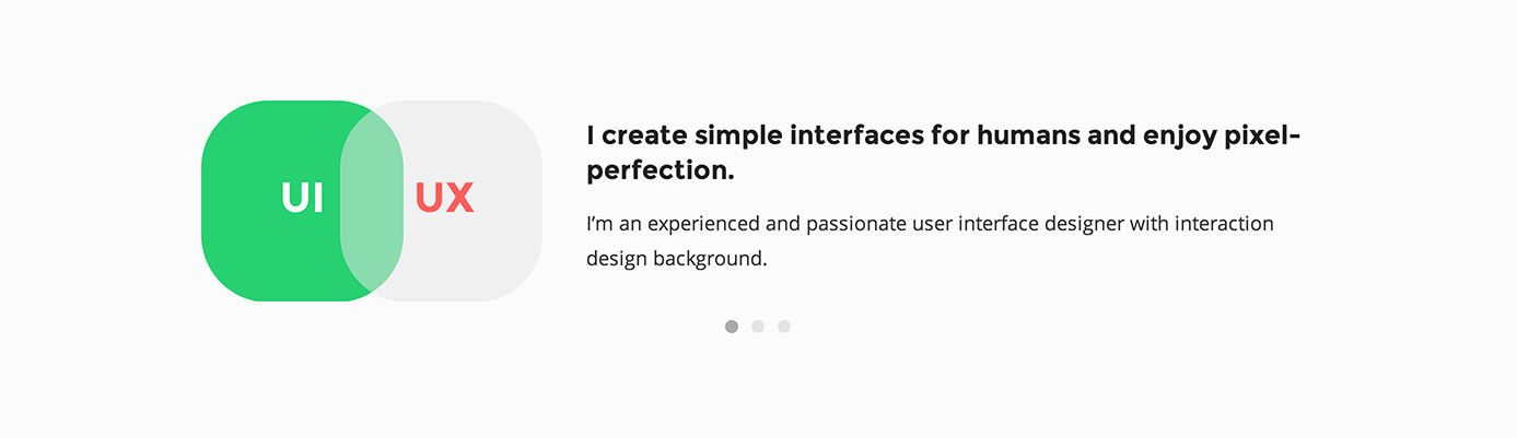
Custom carousel
Custom carousel is almost the same as testimonial carousel. The benefit of using a custom slider is the possibility to configure its content as you like. Here is an example of its use.
<div class="custom-carousel" data-autoplay="5000" data-pagination="true" data-transition="fade" data-autoheight="false">
	<div class="carousel-item">
		<div class="column four">
			<img src="img/resume-img-01.png" alt="">
		</div>
		<div class="column eight last">
			<h3>I create simple interfaces for humans and enjoy pixel-perfection.</h3>
			<p>I’m an experienced and passionate user interface designer with interaction design background.</p>
		</div>
	</div><!-- carousel-item -->
	<div class="carousel-item">
		<div class="column four">
			<img src="img/resume-img-02.png" alt="">
		</div>
		<div class="column eight last">
			<h3>I am a top experience designer.</h3>
			<p>I’m an experienced and passionate user interface designer with interaction design background.</p>
		</div>
	</div><!-- carousel-item -->
	<div class="carousel-item">
		<div class="column four">
			<img src="img/resume-img-03.png" alt="">
		</div>
		<div class="column eight last">
			<h3>I am a Themeforest Elite Author.</h3>
			<p>I’m an experienced and passionate user interface designer with interaction design background.</p>
		</div>
	</div><!-- carousel-item -->
</div>
Note
Custom carousel options are the same as testimonial carousel ones.Dribbble section
The dribbble section allows showing the latest shots from the popular social network.
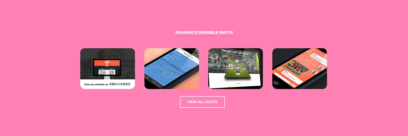
<div class="dribbble-items portfolio-section preload" data-username="frankiefreesbie" data-elements="4">
</div><!-- dribbble-items -->
<div class="more-btn"><a class="button transparent white" href="http://dribbble.com/frankiefreesbie">View all Shots</a></div>
To let the dribbble section work, you need to specify two options through HTML5 attributes.
-
Dribbble username:
Say the right dribble username in the attribute
data-username(ex.:data-username="frankiefreesbie"). -
# of shots to be displayed:
It is possible to choose how many shots you want to show, using the attribute
data-elements(ex.:data-elements="4").
Map section
Maps are provided by Google Maps JavaScript API v3.

<section class="row section">
	<div class="map" data-maplat="40.714353" data-maplon="-74.005973" data-mapzoom="3" data-color="aqua" data-height="22.222" data-img="img/marker.png" data-info="I am based in New York"></div>
</section>
Let’s look through the options that we can manage with HTML5 attributes.
-
Map coordinates:
You need to specify the coordinates expressed in latitude and longitude to center the map in a given point. Let’s say that you want to center the map on NYC; first thing to do is to find the coordinates through an external service, such as iTouchMap.
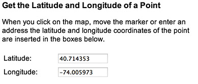
Once found, we can insert them in the attributes
data-maplatanddata-maplon. -
Map zoom level:
The initial resolution at which to display the map, where
data-mapzoom="0"corresponds to a map of the Earth fully zoomed out, and higher zoom levels zoom in at a higher resolution. -
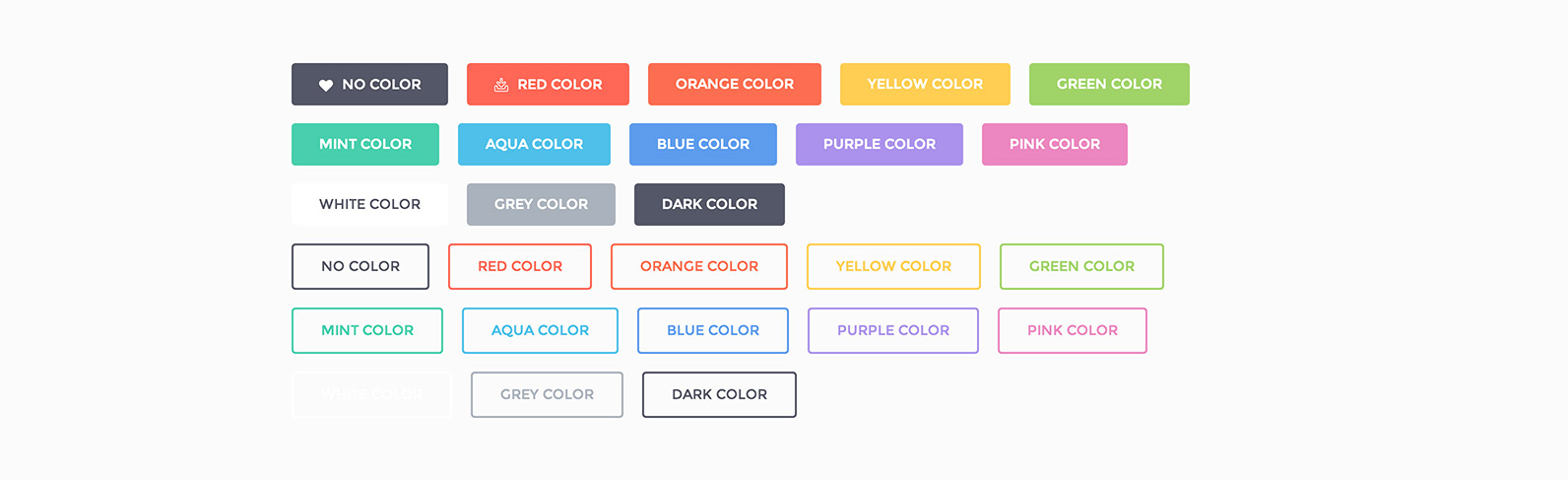
Map styles:
We created preset styles that we can use with the attribute
data-color. Here are all the options:- You don’t need to use the attribute
data-colorto get Google Map default style. - Reversed colors:
data-color="invert" - Bicolor maps:
data-color="red"data-color="orange"data-color="yellow"data-color="green"data-color="mint"data-color="aqua"data-color="blue"data-color="purple"data-color="pink"data-color="white"data-color="grey"data-color="dark-grey"
- You don’t need to use the attribute
-
Map section height:
Section height of the map. The value is expressed in the attribute
data-heightinem, so you use the same principle seen for intro height. -
Image marker:
Use the attribute
data-imgto assign an image to the marker. Ideal marker size is 104x104px. -
Tooltip content:
Assign to the attribute
data-infowhat you want to write in the tooltip.
Contact section
Contact section is a simple form to send emails through a PHP integrated script.
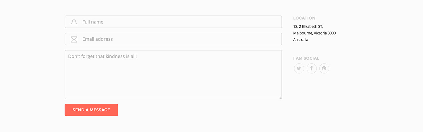
Here is the HTML code of the form:
<form id="contact-form" class="contact-section" method="post" action="">
	<span class="pre-input"><i class="icon icon-user"></i></span>
	<input class="name plain buffer" type="text" name="name" placeholder="Full name">
	<span class="pre-input"><i class="icon icon-email"></i></span>
	<input class="email plain buffer" type="email" name="email" placeholder="Email address">
	<textarea class="plain buffer" name="message" placeholder="Don't forget that kindness is all!"></textarea>
	<input id="send" class="plain button red" type="button" value="Send a Message">
</form>
<div id="success"></div>
Don't forget
The<div id="success"></div> does not have to be removed because you use it to keep the error messages or the sent receipts.
To work properly, the contact form needs the following script before of the tag </body> and after <script src="https://code.jquery.com/jquery.js"></script> in all pages in which it is included:
<script>
$(document).ready(function(){
	$('#send').click(function(){
		$(this).val('Sending ...');
		$('#success p').remove();
		$.post('contact/contact.php', $('#contact-form').serialize(), function(response) {
			$('#success').html(response);
			//$('#success').hide('slow');
			$('#send').val('Send a Message');
		});
		return false;
	});
});
</script>
Don't forget
This script includes the contact.php located into the contact folder. So, if the page containing the contact form is in a different directory from the root, it will be necessary to update the path$.post('contact/contact.php' contained in the script.
Contact Settings
Because the contact form works properly, you need to configure it, putting the email address where you want to receive your messages.
Open the contact.php file located into the contact folder. The only mandatory string to edit because the form works is $to = 'xxxx@xxxx.com'; in which you need to replace xxxx@xxxx.com with your e-mail address.
In this file it is also possible to change other parameters, including error messages or confirmation messages, email header, etc.
Don't forget
Mail delivery is a tricky business... just because you send e-mail does not mean that anyone will receive it. Many receiving servers will simply ignore the incoming message if it does not meet certain criteria. This script has been tested with Gmail but it may not work with Hotmail. We strongly recommend to test it before publishing your website.Other elements
Let’s take a look at the other elements provided by this template.
Buttons
Here is the HTML basic code for a button.
<a class="button href="#">Button</a>To create an outlined button you just need to add .transparent:
<a class="button transparent" href="#">Button</a>To assign a different color you need to choose among one of the built-in colors:
<a class="button transparent red" href="#">Button</a>The colors provided use the following classes: .red, .orange, .yellow, .green, .mint, .aqua, .blue, .purple, .pink, .white, .grey and .dark-grey.
To add an icon to the button you will have to specify <i> tag containing the class shown in the icons section. Ex.:
<a class="button red" href="#"><i class="icon icon-download"></i>Red Button</a>Icons
Two icon fonts comes with this template: Font Awesome by Dave Gandy and Line icon set by Situ Herrera.
Font Awesome
Use the following code for the retro camera from Font Awesome 4.0.3 set:
<i class="fa fa-camera-retro"></i>Here is the Font Awesome cheat sheet including all the icons.
Line icon set
Use the following code for the diamond icon from Line icon set:
<i class="icon icon-diamond"></i>Here is the Line icons cheat sheet including all the icons.
Lightbox
We have included a nice lightbox for galleries. It takes advantages of ImageLightbox.js plugin by Osvaldas Valutis.
To make lightboxes correctly work you need to add a .lightbox class to the .grid-items (see sample page works-4-columns-lightbox.html included in template). Don’t forget that you need to add the attribute data-lightbox="gallery-1" to every element you want to include in the gallery, where gallery-1 is a set of images that includes the chosen one. You can add how many groups you want, you just need to add a number after gallery- for every set of images.
Portfolio filters
Works (or Portfolio) page takes advantages of Shuffle plugin by @Vestride for creating masonry layouts. This plugin includes a feature for filtering items. Let's see how it works in details.
First you need to set a list of filters giving a specific name for every data-group. Ex.:
<ul class="inline cats filter-options">
	<li data-group="advertising">Advertising</li>
	<li data-group="fun">Fun</li>
	<li data-group="icons">Icons</li>
	<li data-group="infographics">Infographics</li>
	<li data-group="lightbox">Lightbox</li>
	<li data-group="minimal">Minimal</li>
	<li data-group="web-design">Web design</li>
</ul>
At this point you can assign one or more categories to a single item through the attribute data-groups. Ex.:
<article class="item column four" data-groups='["lightbox", "minimal"]'>
	<figure><img src="img.jpg" alt=""></figure>
	<a class="overlay" href="#">
		<div class="overlay-content">
			<div class="post-type"><i class="icon icon-video"></i></div>
			<h2>The title</h2>
			<p>The excerpt</p>
		</div><!-- overlay-content -->
	</a><!-- overlay -->
</article>
Credits
Here is the list of the awesome resources we used to create this template.
- Font Awesome
- Line icon set
- jQuery
- Layers CSS framework
- Modernizr
- waitForImages
- Skrollr
- OWL Carousel
- Easy Pie Chart
- onScreen
- Shuffle (Masonry)
- jribbble
- Fluidvids.js
- ImageLightbox.js
- jquery-countTo
- Google Maps JavaScript API v3
Images we used in our demo are courtesy of: