Еще одно сss оформление чекбоксов, радио и формы поиска
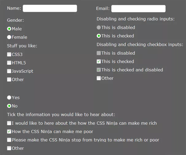
Наткнулся на очень хороший архив и решил его выложить в своем блоге. Представляю вам css3 оформление чекбоксов, радио и форм для заполнения (поисковых форм или, например, формы для подписки на email). Понравилось мне это оформление html форм тем, что здесь не используются скрипты, все работает и отображается только на css. Простейший html код, простейший css (ну правда нельзя назвать css3 простейшим).
Я считаю разработчики браузеров не очень хорошо поработали над визуальным исполнением html форм (chekbox, radio, text, email и так далее) и сделали их сырыми. Поэтому считаю обязательным применять стили к этим параметрам. Например такие, как в этом топике.
Применить стили можно следующим образом:
Сначала создадим html форму (я возьму пример чекбокса)
<input type="checkbox" value="CSS3" id="css3" />
<label for="css3">CSS3</label>
Далее просто применяем к нему вот эти стили и подгружаем изображение, которое есть в архиве
input { padding: 0; margin: 0; height: 16px; width: 16px; float: left; position: absolute; left: 0; opacity: 0; }
p > label { float: left; line-height: 16px; color: #fff; padding: 0 0 0 18px; -moz-transition: color 1s ease; -o-transition: color 1s ease; -webkit-transition: color 1s ease; transition: color 1s ease; }
p:not(#foo) > input:hover + label, p:not(#foo) > input:focus + label, p:not(#foo) > input + label:hover, p:not(#foo) > input:focus + label { text-shadow: 1px 1px 3px #000; color: #2C7AD0; }
p:not(#foo) > input + label { background: url(gr_custom-inputs.png) 0 -1px no-repeat; height: 16px; }
p:not(#foo) > input[type=radio] + label { background-position: 0 -161px; }
/* Checked styles */
p:not(#foo) > input[type=radio]:checked + label { background-position: 0 -241px; }
p:not(#foo) > input[type=checkbox]:checked + label { background-position: 0 -81px; }
p:not(#foo) > input[type=checkbox]:hover:checked + label, p:not(#foo) > input[type=checkbox]:focus:checked + label, p:not(#foo) > input[type=checkbox]:checked + label:hover, p:not(#foo) > input[type=checkbox]:focus:checked + label { background-position: 0 -101px; }
p:not(#foo) > input[type=radio]:hover:checked + label, p:not(#foo) > input[type=radio]:focus:checked + label, p:not(#foo) > input[type=radio]:checked + label:hover, p:not(#foo) > input[type=radio]:focus:checked + label { background-position: 0 -261px; }
/* Hover & Focus styles */
p:not(#foo) > input[type=checkbox]:hover + label, p:not(#foo) > input[type=checkbox]:focus + label, p:not(#foo) > input[type=checkbox] + label:hover { background-position: 0 -21px; } p:not(#foo) > input[type=radio]:hover + label, p:not(#foo) > input[type=radio]:focus + label, p:not(#foo) > input[type=radio] + label:hover { background-position: 0 -181px; }
/* Active styles */
p:not(#foo) > input[type=checkbox]:active + label, p:not(#foo) > input[type=checkbox] + label:hover:active { background-position: 0 -41px; }
p:not(#foo) > input[type=radio]:active + label, p:not(#foo) > input[type=radio] + label:hover:active { background-position: 0 -201px; }
p:not(#foo) > input[type=checkbox]:active:checked + label, p:not(#foo) > input[type=checkbox]:checked + label:hover:active { background-position: 0 -121px; }
p:not(#foo) > input[type=radio]:active:checked + label, p:not(#foo) > input[type=radio]:checked + label:hover:active { background-position: 0 -281px; }
/* Disabled styles */
p:not(#foo) > input[type=checkbox]:disabled + label, p:not(#foo) > input[type=checkbox]:hover:disabled + label, p:not(#foo) > input[type=checkbox]:focus:disabled + label, p:not(#foo) > input[type=checkbox]:disabled + label:hover, p:not(#foo) > input[type=checkbox]:disabled + label:hover:active { background-position: 0 -61px; }
p:not(#foo) > input[type=radio]:disabled + label, p:not(#foo) > input[type=radio]:hover:disabled + label, p:not(#foo) > input[type=radio]:focus:disabled + label, p:not(#foo) > input[type=radio]:disabled + label:hover, p:not(#foo) > input[type=radio]:disabled + label:hover:active { background-position: 0 -221px; }
p:not(#foo) > input[type=checkbox]:disabled:checked + label, p:not(#foo) > input[type=checkbox]:hover:disabled:checked + label, p:not(#foo) > input[type=checkbox]:focus:disabled:checked + label, p:not(#foo) > input[type=checkbox]:disabled:checked + label:hover, p:not(#foo) > input[type=checkbox]:disabled:checked + label:hover:active { background-position: 0 -141px; } p:not(#foo) > input[type=radio]:disabled:checked + label, p:not(#foo) > input[type=radio]:hover:disabled:checked + label, p:not(#foo) > input[type=radio]:focus:disabled:checked + label, p:not(#foo) > input[type=radio]:disabled:checked + label:hover, p:not(#foo) > input[type=radio]:disabled:checked + label:hover:active { background-position: 0 -301px; }
Думаю вам надо посмотреть демонстрацию и убедиться своими глазами, что такое оформление html форм достойно вашего проекта.


Комментарии ()